
Cinematic color grading with AI
Six color scripts, a prompt structure that puts colour in the right line, and the skin-tone checks that separate a film look from a filter.
What cinematic color grading actually controls
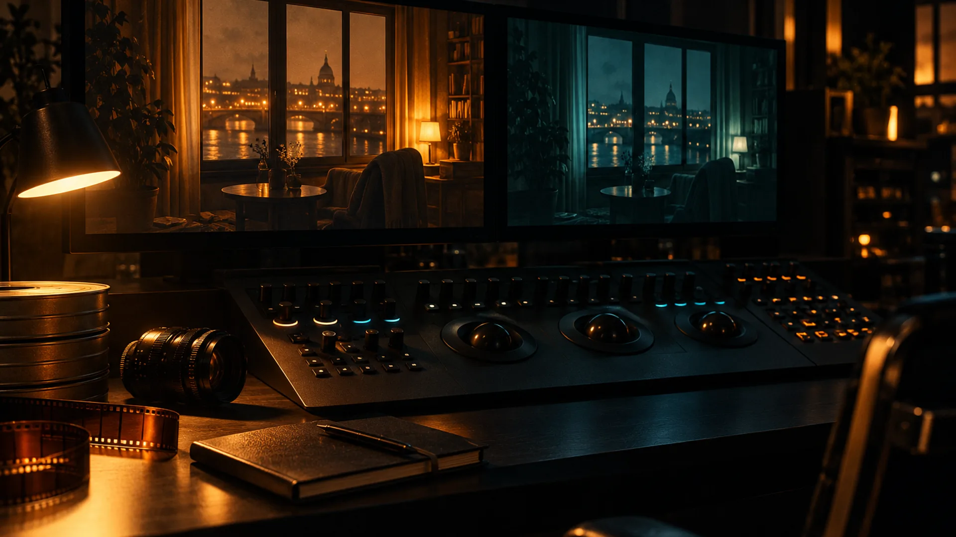
Color grading is not one slider and not a teal-orange filter. It is a short chain of decisions that changes how a frame reads before the audience has time to name it: where the eye goes, what the light feels like, whether the skin belongs in that world, and whether the blacks hold their detail.
The order matters. Correct first, then grade. A frame with a believable white balance and a clean exposure can take a strong palette; a frame that starts with a cast and a clipped highlight will fight every colour choice you make.
- Exposure and contrast: what is black, what is white, and how much of the frame sits in shadow.
- White balance: the neutral point the eye reads as normal, before any stylistic tint.
- Palette: the two or three colours that carry the scene, and the one accent that gets attention.
- Skin: the colour that exposes a bad grade faster than any other part of the image.
- Saturation and texture: how much colour the frame can hold before it looks synthetic, and how much grain keeps it photographic.
Six color scripts that read instantly
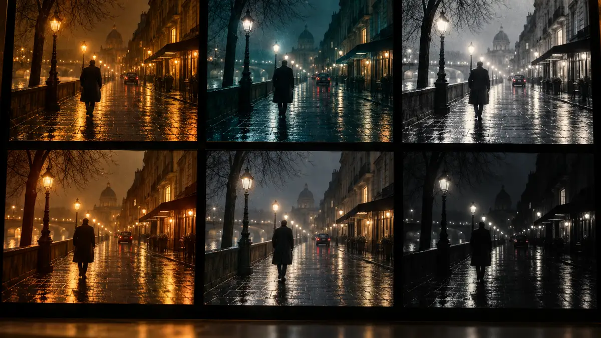
A color script is a recipe with a point of view. These six cover most of the cinematic looks people search for, and each one can be written into a prompt without naming a LUT.
- Sodium noir: warm sodium streetlamps against a blue-black night, wet asphalt holding amber reflections, skin warmed by the practical and the background left cold.
- Teal-orange: a warm key on the subject and a cool ambience behind, with the contrast kept in the light rather than pushed in saturation.
- Bleach bypass: silver highlights, desaturated colour and crushed contrast, as if the film skipped a dye step; best for war, crime and memory.
- Warm period: amber windows, cream walls, tobacco browns and soft highlights; the frame feels lit by practicals that existed before electricity was clean.
- Cool procedural: fluorescent green-cyan, cold corridors, grey skin and almost no warm accent; the palette of institutions and surveillance.
- Naturalistic: neutral skin, soft daylight, a restrained palette and texture over saturation; the look that survives the widest range of screens.
The prompt structure: put colour in its place
The five-line shot brief used across this site has a natural colour line: subject and blocking, light, lens and frame, palette, stock and grain. The palette line is where the grade begins; the stock line is where it finishes. If you write colour as a mood word at the top, the model has nothing to attach it to.
A working prompt names the source, the direction and the colour relationship. It does not list ten adjectives. The useful formula is: what the light is, where it comes from, what colour it burns, what stays neutral, and what texture the frame should carry.
- Name the key: “single sodium streetlamp from frame left” beats “moody lighting”.
- Name the ambience: “blue-black night sky and wet asphalt” gives the palette a second pole.
- Protect the skin: “warm skin, neutral midtones, no green cast” is a grade instruction, not a mood.
- Choose one accent: a red coat, a cyan sign, a warm window; one accent reads, three accents compete.
- Finish with stock and grain: “Kodak Vision3 500T, fine 35mm grain, halation on the practicals” gives the colour a physical home.
LUT, prompt or post?
These three tools do different jobs, and most bad grades come from asking one to do the work of another. A prompt decides the light and the palette that the model renders. A LUT is a fixed transform applied after the image exists. Post is where you match a sequence, fix a single shot and prepare delivery.
Use the prompt when you are still deciding what the frame is. Use a LUT when you have a look that must be identical across many frames and the source is already consistent. Use post when one frame is slightly off and re-rendering would cost more than a correction.
If an exact wardrobe or brand colour has to survive a re-render, the better tool is palette lock; if you need a precise value before the first render, start with Soul HEX. The full brief structure is in Soul Cinema prompts.
Protecting skin tones
Skin is the test every grade has to pass. A teal shadow can be beautiful until it reaches a cheekbone; a warm key can be flattering until every face in the sequence is the same orange. The fix is not to desaturate everything. It is to decide what stays neutral and to protect that decision frame by frame.
Keep one neutral reference in the sequence: a frame lit by soft daylight or a white card, where the skin reads as skin. Match the graded frames against it rather than against memory. If the neck and hands have gone green while the face is still warm, the grade is being applied globally; pull the tint out of the midtones before you push the highlight.

A repeatable grading workflow
A grade that can be repeated is worth more than a grade that looks good once. This is the loop that keeps a sequence coherent without turning every frame into a correction job:
- Render a neutral reference at 2K: soft light, no strong palette, the cast in a simple wardrobe.
- Choose one color script and write it into the palette line, not into a pile of adjectives.
- Test the script on three light conditions: warm practical, cool daylight, mixed night.
- Compare the three at 100%: skin, black level, highlight colour and grain should all survive.
- Lock the winning brief, then change one variable per frame: angle, blocking or light direction.
- Promote only the frames that hold to 4K or 8K; the rest stay at 2K and get a new test.
The mistakes that flatten a frame
Most of the damage happens before the grade is finished. These are the repeat offenders:
- Global teal: the whole frame is pushed cold, including the skin, until the face looks unwell.
- Lifted blacks: every shadow is grey, so the frame has no weight and the practicals lose their punch.
- Too many accents: three neon colours, a warm lamp and a red coat all compete for the same eye.
- Saturation as contrast: the image looks colourful but flat because the light has no direction.
- A different palette per frame: the sequence reads as a mood board rather than one scene.
- Grain after the grade: texture sits on top of the colour instead of belonging to it; render the grain with the frame.
Frequently asked
What is cinematic color grading in AI image generation?
It is the set of colour decisions that make a generated frame read as film: the neutral point, the palette, the skin, the black level and the texture. In a prompt it is mostly the light and palette lines; in post it is the final match across a sequence.
Can I use a LUT with AI images?
Yes, but a LUT is a fixed transform applied after the image exists. It is useful for matching a set of already-consistent frames; it cannot fix a frame whose light direction or skin tone is wrong. Decide the look in the prompt first, then use a LUT to repeat it.
How do I keep skin tones natural?
Keep one neutral reference frame, protect the midtones, and avoid a global teal or orange wash. Check the neck and hands as well as the face. If the cast is already in the render, correct the light and palette in the prompt before adding more saturation.
What is the difference between palette lock and color grading?
Palette lock pins a requested hex value so a wardrobe or accent colour survives a re-render. Color grading is the wider decision about light, contrast, skin and mood. Use palette lock for the colour that must not drift; use grading for the look of the frame.
Which color script should I start with?
Start with naturalistic if you are testing a new model, because it exposes skin and black-level problems fastest. Move to sodium noir or teal-orange once the neutral frame holds. Bleach bypass and cool procedural are stronger choices once the sequence already has a consistent cast and wardrobe.
Does color grading work at 8K?
The grade is decided before the upscale, but 8K can exaggerate a colour shift in fine detail. Pin the important colours, finish the look at 2K or 4K, and only upscale the frames that already pass the skin and black-level check.
Your first cinematic frame is one prompt away
Sign in with Google, pick a plan and keep every still at the resolution the model produced. Plans from $12/month, cancel at any time. No watermark, no re-encode.