
Cinematic album cover AI
A square-first workflow for cinematic album artwork: one visual idea, a quiet title zone, a repeatable stock and a thumbnail test before typography.
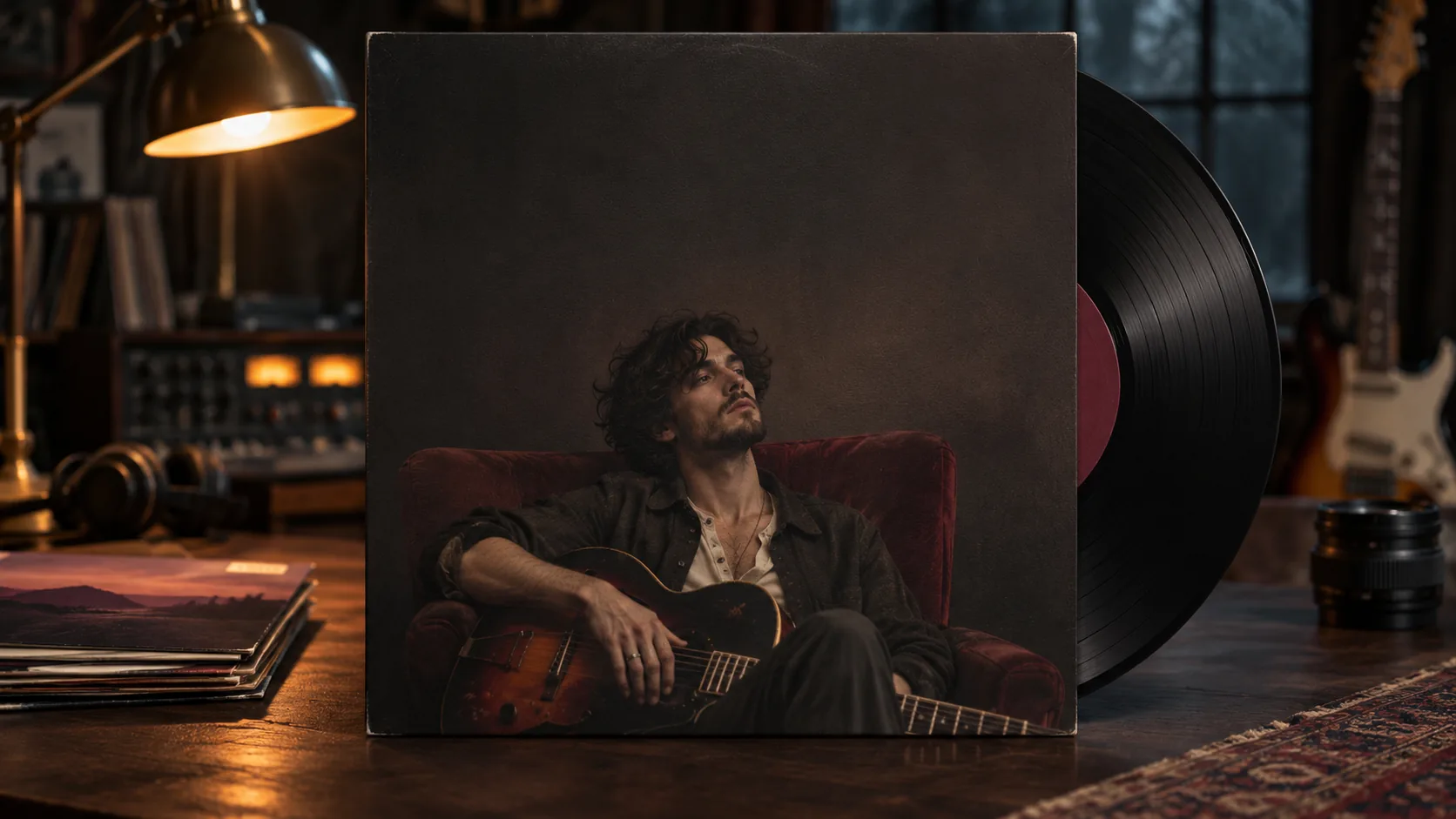
What makes an album cover cinematic?
A cinematic album cover is not a movie poster shrunk to a square. It is one visual idea that carries the sound: a face, a place, an object or a graphic field, lit with intention and composed to survive a streaming thumbnail. The cover has to work before anyone reads the title.
That is why the best covers look simple at 80 pixels and rich at full size. The composition guide covers the eye-path mechanics; this page applies them to a square that will spend most of its life small.
Soul Cinema renders the artwork. It does not set a title or artist name; the typography belongs in a design tool after the image is approved.
Why is the 1:1 square the wrong shape to compose last?
Most streaming and storefront covers are square. If you compose in 16:9 and crop to 1:1 at the end, you usually cut the subject’s head, the horizon or the negative space you needed for the title. The square has to be the composition, not a crop.
Soul Cinema supports 1:1 natively, so choose it before the first render. Decide where the subject sits, where the title goes and what the safe margin is. If the cover will also appear in a wide or vertical format, compose the square first and extend it in a design tool rather than squeezing the square into another ratio.
- Choose 1:1 before the first render.
- Put the subject off-center or low, not dead center.
- Reserve a title zone at the top or bottom.
- Keep a 10–15 percent safe margin from the edges.
- Test the square at 80, 160 and 320 pixels.
- Extend to other ratios in a design tool, not by cropping the square.
Where should the title and artist name go?
Put the title in the quietest part of the frame. A dark sky, a flat wall, a shadow field or a deliberate negative-space block can hold type; a busy face or a detailed landscape cannot. The artist name can sit below the title or in a small strip at the bottom.
Leave more space than feels comfortable. Type needs air, and streaming interfaces often add their own chrome around the artwork. If the title is fighting the image, the image is doing too much; simplify the composition before adding type.
Typography is part of the cover, not a label applied afterward. A heavy condensed sans can read as a poster; a light serif can read as a singer-songwriter record; a hand-drawn mark can read as a limited release. Choose the type after the artwork, but keep the title zone large enough that the type can breathe.
- Top or bottom third, not the middle of the face.
- One quiet area, not a detailed texture.
- Title and artist name in one visual block.
- At least 10 percent margin from the edge.
- No text baked into the AI render.
- Test the cover with a placeholder title in your design tool.
Which light, palette and lens sell the sound?
The cover’s light should match the record’s emotional temperature. A warm Portra-like portrait suits singer-songwriter and folk; a hard tungsten night with halation suits electronic and hip-hop; a cool, controlled Vision3 night suits cinematic indie; black-and-white grain suits punk, jazz or a classic reissue.
Pick one stock and one lens logic, then keep them across the release campaign. The film stock prompts and the depth of field prompts explain how to make those choices repeatable.
| Sound | Light | Palette | Lens |
|---|---|---|---|
| Singer-songwriter | Soft window light, warm practical. | Cream, amber, faded green. | 50mm, medium shot. |
| Electronic / club | Hard practical, neon edge, halation. | Black, sodium amber, one accent. | 35mm, wide portrait. |
| Indie / cinematic | Cool night, warm practical, low fill. | Steel blue, amber, charcoal. | 85mm, close portrait. |
| Jazz / reissue | Hard side key, smoke, deep shadow. | Black, bone white, silver. | 50mm, medium close-up. |
| Experimental | Abstract light, long exposure feel. | One dominant hue plus black. | Any lens; composition first. |
How do you test a cover at streaming thumbnail size?
Test the cover at 320 pixels, then 160, then 80. At 320 you should see the subject and the title zone; at 160 the shape should still read; at 80 it should be one recognizable silhouette or color field. If it becomes mush, the design is too detailed.
Run the test before adding type and again after. A title can rescue a quiet image or destroy a busy one. If the title disappears at 160 pixels, the contrast between type and background is too low, not the image.
- View the artwork at 320px, 160px and 80px.
- Check that one shape or face survives at 80px.
- Check that the title zone is still quiet.
- Add a placeholder title in a design tool.
- Re-test at the same three sizes.
- Compare against three covers in the same genre.
Which six album cover concepts can you brief?
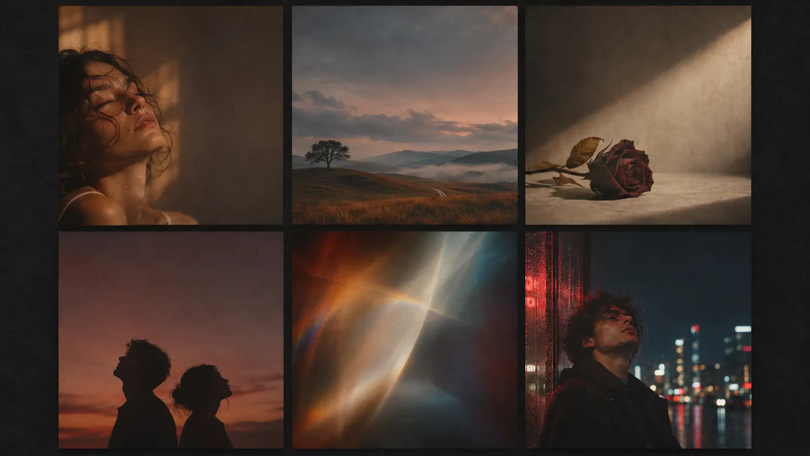
Six concepts cover most of the square: the portrait, the landscape, the object, the duo, the abstract field and the night scene. Each one gives the title a different place to live and the record a different emotional temperature.
| Concept | Composition | Title zone | Best for |
|---|---|---|---|
| Portrait | Subject off-center, eyes or profile, shallow focus. | Top third or bottom strip. | Singer-songwriter, soul, indie. |
| Landscape | Small figure in a large place, wide horizon. | Sky or foreground shadow. | Cinematic indie, folk, ambient. |
| Object | One symbolic object on a plain field. | Generous negative space above. | Electronic, experimental, reissue. |
| Duo | Two figures, distance or touch, asymmetric. | Side or bottom negative space. | Collaboration, romance, hip-hop. |
| Abstract | Light, color or texture as the subject. | Any quiet field. | Club, experimental, soundtrack. |
| Night scene | Street, neon, wet reflections, lone figure. | Dark sky or shadow block. | Hip-hop, electronic, nocturnal pop. |
How do you keep a cover series consistent?
Keep the palette, lens, stock, title zone and subject scale fixed across the single, EP and album. A series reads as one artist because the second cover contains evidence of the same visual rules as the first, not because every cover uses the same template.
Review the set as a contact sheet at thumbnail size. Use Palette Lock for the accent and Soul ID for a recurring artist portrait. The film treatment workflow is a useful model for deciding the rules before the first cover.
What are common AI album cover mistakes?
The first mistake is asking the model to render the title. Image models still produce unreliable lettering, and a single misspelled word ruins the cover. The second is composing in 16:9 and cropping to a square. The third is filling every corner with detail so the cover turns to mush at 80 pixels.
The fourth is a centered face with no title space. The fifth is a generic neon city that could belong to any artist. The sixth is an inconsistent series: different stock, palette or type zone on every release. A cover is a brand asset, not a one-off image.
- AI-rendered title or artist name.
- 16:9 composition cropped to 1:1.
- Too much detail for an 80px thumbnail.
- Centered face with no quiet title zone.
- Generic neon or smoke with no identity.
- Inconsistent palette or type zone across releases.
Frequently asked
Can AI make a complete album cover with text?
AI can make the artwork, but reliable typography still belongs in a design tool. Generate the cover art first, leave a title-safe area, then add the artist name and title in a layout tool.
What aspect ratio should an album cover be?
Most streaming and storefront covers are 1:1 square. Soul Cinema supports 1:1 natively, so compose the square first rather than cropping a wide image later.
Where should the title go on an album cover?
Put it in the quietest part of the frame, usually the top or bottom third, with at least a 10 percent margin from the edge. Never place it over a busy face or detailed texture.
How do I test an album cover at thumbnail size?
View it at 320, 160 and 80 pixels. At 80 pixels one shape or face should still read, and the title zone should still be quiet. Test again after adding placeholder type.
How do I keep a cover series consistent?
Fix the palette, lens, stock, title zone and subject scale across the release. Review the set as a contact sheet at thumbnail size before approving a new cover.
Does Soul Cinema add the artist name and title?
No. Soul Cinema renders the artwork only. The title and artist name are added in a design tool after the image is approved.
Your first cinematic frame is one prompt away
Sign in with Google, pick a plan and keep every still at the resolution the model produced. Plans from $12/month, cancel at any time. No watermark, no re-encode.