
Cinematic YouTube thumbnail AI
A 16:9 thumbnail workflow for cinematic stills: one anchor, one text-safe side, strong value contrast and a 320px readability test before typography.
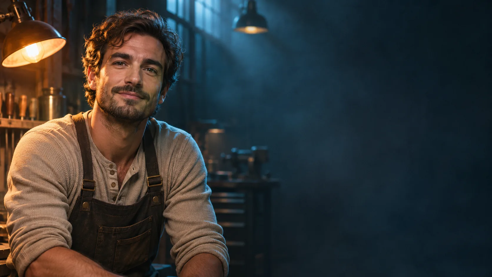
What makes a thumbnail cinematic without becoming a poster?
A cinematic YouTube thumbnail is a film still with a job: stop the scroll at 320 pixels and leave room for a title. It borrows the light, lens and grade of a movie frame, but it does not need the narrative density of a poster. One face, one place or one object is enough.
The hard constraint is size. A thumbnail is mostly seen small, on a phone, next to a dozen competing images. The composition guide covers the eye path; this page covers the 16:9 thumbnail-specific decisions.
Soul Cinema renders the frame. The title text is added in a design tool after the image is approved.
How do you compose for 16:9 and the safe zone?
Compose for 16:9 from the first render. Keep the subject on one third and reserve the other side for the title. Leave a margin from the edges because platform UI can overlay timestamps and duration badges.
A simple split works: subject left, text right, or subject right, text left. The subject should not be so centered that the title has to sit on top of a face. If the image will be cropped for Shorts or other formats, keep the subject inside a central safe area as well.
Remember that the thumbnail also competes with the platform UI: a duration badge in the corner, a progress bar, a title below. Keep the subject and the text out of the bottom-right corner and leave the edges quiet. The thumbnail is never seen alone; it is seen inside a feed with other thumbnails and interface elements.
- 16:9 native composition.
- Subject on one third.
- Reserve the opposite third for the title.
- Keep 10 percent margin from the edges.
- Keep the subject inside a central safe area for crops.
- Test the frame at 320px before adding text.
Face or scene: which should carry the thumbnail?
A face carries personality, reaction and click intent; a scene carries scale, atmosphere and curiosity. Reaction, tutorial and story videos usually need a face. Documentary, travel and mystery videos can use a scene with a small human figure.
The strongest thumbnails often combine both: a face in the foreground and a place in the background. Keep the face sharp and the background readable but secondary. If the face is small and the scene is busy, the thumbnail loses its human anchor.
| Video type | Primary anchor | Secondary | Title side |
|---|---|---|---|
| Reaction | Face, close and expressive. | Blurred context. | Opposite the face. |
| Documentary | Scene with a small figure. | Location texture. | Quiet sky or dark area. |
| Tutorial | Hands or object, close. | Desk or workspace. | Clean side field. |
| Mystery | Threshold or silhouette. | Negative space. | Dark area beside the subject. |
| Travel | Landscape with a traveler. | Atmosphere. | Sky or foreground shadow. |
| Story | Face plus scene. | One strong light. | Opposite the face. |
How do you keep contrast at 320px?
At 320 pixels, detail disappears and value contrast remains. Use one bright subject against a darker background, or one dark silhouette against a bright sky. Avoid midtone-on-midtone compositions where the subject dissolves into the background.
A rim light or a hard side key separates the subject from the background. If the thumbnail is still muddy at 320 pixels, simplify the background and increase the separation before adding text. Contrast is the thumbnail’s first job; color is second.
- One bright subject against a dark field, or the reverse.
- Avoid midtone-on-midtone.
- Use a rim light or hard side key.
- Simplify the background.
- Test in grayscale at 320px.
- Add text only after the image reads.
Which light and palette work at small size?
Use one warm key and one cool separation, or one hard source and a deep shadow. Two or three colors are enough; a rainbow of neon becomes noise at thumbnail size. A warm face against a cool background is a reliable pattern because skin stays readable.
Film grain and halation can add texture, but they should not reduce clarity. Keep the grade restrained: a strong teal-orange look can work, but a muddy midtone grade will collapse at 320 pixels. Test the palette in grayscale before committing.
- Warm key, cool rim, or hard key with deep shadow.
- Two or three dominant colors.
- Skin readable at small size.
- Restrained grain and halation.
- Avoid muddy midtones.
- Test the palette in grayscale.
Which six thumbnail concepts can you brief?
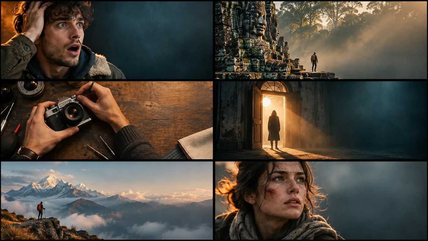
Six concepts cover most videos: reaction, documentary, tutorial, mystery, travel and story. Each one names the anchor, the light, the lens and the title side before the render.
| Concept | Anchor | Light | Title side |
|---|---|---|---|
| Reaction | Close face, left third. | Warm key, cool background. | Right third. |
| Documentary | Small figure in a location. | Natural hard light, haze. | Quiet sky or dark field. |
| Tutorial | Hands and object on a desk. | Soft side light, practical. | Clean right field. |
| Mystery | Doorway or silhouette. | Hard side key, deep shadow. | Dark area beside the subject. |
| Travel | Landscape with a traveler. | Golden hour, atmospheric depth. | Sky or foreground shadow. |
| Story | Face plus scene. | Warm face, cool environment. | Opposite the face. |
Where does the text go?
Put the title on the quiet side, not over the face. Two or three words are usually enough; a long title at thumbnail size becomes a gray bar. The text should be added in a design tool with a heavy, readable face and a clear outline or shadow only if the background needs it.
Do not ask the image model to render the title. AI lettering is still unreliable, and a misspelled word is worse than no text. Generate the frame with a blank text zone, then add typography in your editor.
Use a type style that survives compression: a heavy sans, high contrast and no thin strokes. If the title is two lines, keep the line length short and the block on the quiet side. A thumbnail with a strong image and weak type loses the click to a weaker image with a clearer promise.
- Text on the quiet side, opposite the anchor.
- Two or three words, not a sentence.
- Heavy readable type, strong contrast.
- No AI-rendered lettering.
- No text over the face or eyes.
- Test the final thumbnail at 320px.
What are common AI thumbnail mistakes?
The first mistake is asking for a complete thumbnail with text. The second is a centered face with no room for the title. The third is too much detail for 320 pixels. The fourth is low contrast between the subject and the background.
The fifth is a generic stock-photo look with no film language. The sixth is a misleading image that does not match the video. A thumbnail is a promise; the cinematic treatment should support the promise, not replace it.
Finally, check the thumbnail next to the actual video title. The image and the title should not repeat each other; the thumbnail should add a visual promise the title cannot carry on its own.
- AI-rendered title text.
- Centered face with no title space.
- Too much detail at 320px.
- Low subject-background contrast.
- Generic stock-photo lighting.
- An image that does not match the video.
Frequently asked
Can AI make a YouTube thumbnail with the title text?
AI can make the image, but the title text should be added in a design tool. Generate a 16:9 frame with a blank text zone, then add two or three words in a heavy, readable typeface.
What size should a YouTube thumbnail be?
The standard is 16:9 at 1280×720 or larger. Soul Cinema supports 16:9 natively; export at the highest available resolution and test the final image at 320 pixels wide.
Should a thumbnail use a face or a scene?
Reaction, tutorial and story videos usually need a face. Documentary, travel and mystery videos can use a scene with a small figure. The strongest thumbnails often combine a face in the foreground with a place in the background.
How do I make a thumbnail readable at small size?
Use one dominant subject, strong value contrast and a simple background. Test in grayscale at 320 pixels; if the subject disappears, increase separation before adding text.
Where should the title go on a thumbnail?
Put it on the quiet side opposite the subject, usually the left or right third. Avoid the face, keep it to two or three words and test the final image at 320 pixels.
Does Soul Cinema add the thumbnail text?
No. Soul Cinema renders the image only. The title text is added in a design tool after the frame is approved.
Your first cinematic frame is one prompt away
Sign in with Google, pick a plan and keep every still at the resolution the model produced. Plans from $12/month, cancel at any time. No watermark, no re-encode.