
Cinematic book cover AI
A title-safe workflow for cinematic book cover art: choose the delivery ratio, protect the title zone, test the thumbnail and add typography in a design tool.
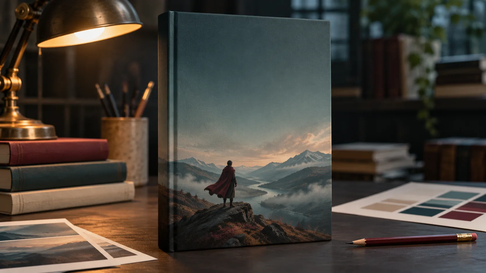
What makes a book cover cinematic?
A cinematic book cover is a single image that carries a genre promise. It does not illustrate the whole plot; it gives the reader one mood, one place and one question. The title and author name then sit in the quiet part of the frame.
The difference between a book cover and a film still is the title-safe space. A still can fill the frame; a cover must leave room for type and still read at a bookstore thumbnail. The composition guide covers the eye path; this page covers the cover-specific constraints.
Soul Cinema renders the artwork. The title, author name and series mark are added in a design tool after the image is approved.
Which ratio should you use: 4:5, 2:3 or 3:4?
Book covers vary by market, format and retailer. 4:5 is a safe cinematic ratio and is native in Soul Cinema; 2:3 and 3:4 are common in publishing but require a design-tool crop or extension. Choose the ratio your final retailer or print format actually uses before you render.
If you need multiple formats, compose the 4:5 native image with generous margins, then extend the background in a design tool rather than cropping the subject. A cover that loses its title zone in a 2:3 crop was composed for the wrong shape.
| Ratio | Use | Soul Cinema |
|---|---|---|
| 4:5 | Cinematic portrait cover, ebook and social. | Native. |
| 2:3 | Common print and retailer cover ratio. | Design-tool crop or extension. |
| 3:4 | Some print and illustrated editions. | Design-tool crop or extension. |
| 1:1 | Square promotional or audiobook art. | Native. |
Where does title-safe space actually go?
Reserve the top third for the title, the bottom strip for the author name and a smaller line for the series or subtitle. Keep the middle for the image. If the title is long, leave more space than you think you need; a two-line title can eat half the cover.
Do not put type over a face, a bright sky or a detailed texture. Darken or simplify the title zone in the artwork itself, not with a heavy drop shadow later. A cover with a clean title block looks designed; a cover with type fighting the image looks assembled.
- Top third: title, two lines maximum.
- Bottom strip: author name and series mark.
- Middle: the image and the subject.
- Avoid type over faces, skies or detailed texture.
- Simplify the title zone in the artwork.
- Test with placeholder type before final art.
How do you compose for a bookstore thumbnail?
The cover will be judged at roughly 80 to 160 pixels wide. At that size, genre must read before detail: a silhouette, a doorway, a landscape, a single object or a face. If the thumbnail is a field of texture, the cover is not doing its job.
Use one dominant shape, one light idea and a clear warm-cool separation. Test at 160 and 80 pixels with a placeholder title. If the title disappears, the title zone is too busy; if the image disappears, the subject is too small or too low-contrast.
- View the cover at 320px, 160px and 80px.
- Check that the genre reads at 80px.
- Check that the title zone stays quiet.
- Add a placeholder title in a design tool.
- Re-test at 160px and 80px.
- Compare against three covers in the same genre.
Which light and palette fit each genre?
Genre is carried by light and palette before it is carried by props. A thriller wants hard shadow and a threshold; a romance wants soft motivated light and a two-shot; fantasy wants scale and atmosphere; science fiction wants industrial texture and a controlled screen light; literary fiction can be quieter and more ambiguous.
| Genre | Light | Palette | Composition |
|---|---|---|---|
| Literary | Soft window light, low contrast. | Cream, faded green, charcoal. | Small figure in a large place. |
| Thriller | Hard side key, deep shadow, doorway. | Black, cold blue, one red accent. | Threshold and negative space. |
| Fantasy | Atmospheric backlight, scale, haze. | Ochre, deep green, bone white. | Tiny traveler, vast landscape. |
| Romance | Soft motivated light, warm practical. | Cream, dusty rose, amber. | Two figures, almost-touch. |
| Sci-fi | Cold industrial key, screen light. | Steel blue, charcoal, amber. | Human scale against structure. |
| Nonfiction | Clean directional light, single object. | Bone white, black, one accent. | Symbolic object with title space. |
Which six book cover concepts can you brief?
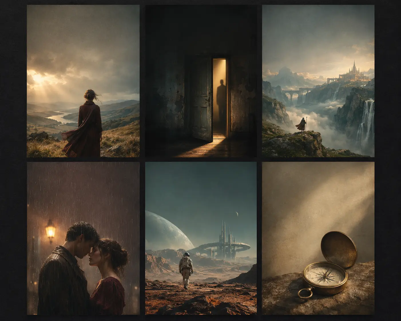
Six concepts cover most of the shelf: literary landscape, thriller doorway, fantasy scale, romance two-shot, science-fiction structure and nonfiction object. Each one gives the title a different place to live and the genre a different signal.
| Concept | Image | Title zone | Genre |
|---|---|---|---|
| Literary landscape | Lone figure in a wide, quiet place. | Top third sky. | Literary fiction. |
| Thriller doorway | Shadowed door, hard side light. | Dark top or bottom block. | Thriller, mystery. |
| Fantasy scale | Tiny traveler, vast structure or landscape. | Top third sky or dark band. | Epic fantasy. |
| Romance two-shot | Two figures, soft rain light, almost-touch. | Bottom strip or side space. | Romance. |
| Sci-fi structure | Human scale against an industrial future. | Top third dark sky or haze. | Science fiction. |
| Nonfiction object | One symbolic object on a clean field. | Generous negative space. | Nonfiction, business, memoir. |
How do you keep a series consistent?
Keep the palette, lens, stock, title zone and subject scale fixed across the series. A series reads as one author or imprint because the second cover contains evidence of the same visual rules as the first, not because every cover repeats the same image.
Series consistency also means a consistent title hierarchy: the same title size, author size and series mark placement on every book. A reader should recognize the series from the spine or the thumbnail before reading the title. If each book invents a new type layout, the series looks like a collection of unrelated covers.
Review the set as a contact sheet at thumbnail size. Use Palette Lock for the accent and Soul ID for a recurring character. The film treatment workflow is a useful model for deciding the visual rules up front.
What are common AI book cover mistakes?
The first mistake is asking the model for the title. The second is composing in the wrong ratio and cropping the title zone later. The third is a busy thumbnail that loses its genre at 80 pixels. The fourth is a generic genre signal: a foggy house for every thriller, a crown for every fantasy.
The fifth is type over a face or a bright sky. The sixth is an inconsistent series with a different palette or type zone on every book. A cover is a shelf asset; consistency is part of the design.
- AI-rendered title or author name.
- Wrong ratio, cropped title zone.
- Busy thumbnail with no genre signal.
- Generic genre clichés.
- Type over a face or bright sky.
- Inconsistent palette or type zone across a series.
Frequently asked
Can AI make a complete book cover with the title?
AI can make the artwork, but reliable typography belongs in a design tool. Generate the cover art with a title-safe area, then add the title, author name and series mark in layout software.
What ratio should a book cover be?
It depends on the retailer and format. 4:5 is a safe cinematic ratio and is native in Soul Cinema; 2:3 and 3:4 are common in publishing and require a design-tool crop or extension.
Where should the title go on a book cover?
Usually the top third, with the author name in the bottom strip and a smaller line for the series or subtitle. Keep the middle for the image and avoid type over faces or bright skies.
How do I test a book cover at thumbnail size?
View it at 320, 160 and 80 pixels. At 80 pixels the genre should still read and the title zone should stay quiet. Add a placeholder title and test again.
How do I keep a book cover series consistent?
Fix the palette, lens, stock, title zone and subject scale across the series. Review the set as a contact sheet at thumbnail size before approving a new cover.
Does Soul Cinema add the book title and author name?
No. Soul Cinema renders the artwork only. The title, author name and series mark are added in a design tool after the image is approved.
Your first cinematic frame is one prompt away
Sign in with Google, pick a plan and keep every still at the resolution the model produced. Plans from $12/month, cancel at any time. No watermark, no re-encode.