
Cinematic Instagram post AI
A feed-first workflow for cinematic Instagram stills: choose 4:5 or 1:1, protect the crop, keep strong value contrast and add text only after the render.
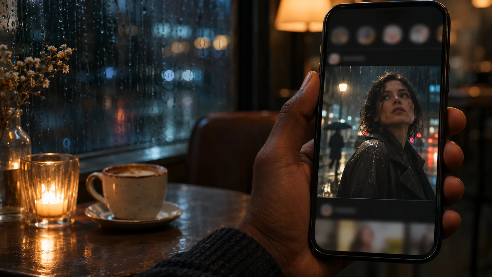
What makes an Instagram post cinematic?
A cinematic Instagram post is a film still that works in a feed: one clear subject, one light idea and enough contrast to survive a phone screen. It is not a movie poster and it is not a filter. The image should feel like a frame from a story, even when it is a single post.
The feed adds two constraints: the crop and the scroll. The composition guide covers the eye path; this page covers the 4:5, 1:1 and 9:16 framing decisions that keep the image readable on a phone.
Soul Cinema renders the still. Captions and cover text are added in the app or a design tool after the image is approved.
Which ratio: 4:5, 1:1 or 9:16?
4:5 gives the most vertical space in the feed and is native in Soul Cinema. 1:1 is the classic square and is also native. 9:16 is the Stories/Reels format; it requires a design-tool crop or extension, so compose with a central safe area if you plan to use it.
Choose the ratio before the render. A portrait composed for 4:5 can usually extend to 9:16, but a wide 16:9 image cropped to 9:16 loses its subject. If the post will run in multiple formats, keep the subject inside a central vertical safe area.
| Ratio | Use | Soul Cinema |
|---|---|---|
| 4:5 | Feed portrait, maximum vertical space. | Native. |
| 1:1 | Classic square feed post. | Native. |
| 9:16 | Stories, Reels, full-screen mobile. | Design-tool crop or extension. |
| 16:9 | Landscape feed or video still. | Native. |
How do you compose for the feed crop?
Keep the subject inside the central area, away from the edges. The feed may crop the image in a grid or a preview, and the app adds UI around it. A face near the top edge can be clipped; a title near the bottom can be covered by the caption.
Compose with one dominant shape and a quiet area for any text. If the image will be part of a grid, consider how it sits next to the other posts: a consistent palette and subject scale matter more than a single perfect frame.
Think in carousels and grids, not single posts. A carousel can alternate a wide establishing frame with a detail and a portrait; a grid can repeat a palette or a subject scale. The individual post should work alone, but the sequence is what makes the feed feel intentional.
- Subject inside the central safe area.
- Face away from the top edge.
- Quiet area for caption or cover text.
- One dominant shape.
- Consistent palette across the grid.
- Test the crop in the app preview.
How do you keep contrast in a bright feed?
A feed is bright, crowded and small. The image needs one strong value contrast: a bright subject against a dark field, or a dark silhouette against a bright sky. Midtone-on-midtone images disappear, even when they look subtle and beautiful at full size.
Use a warm key and a cool separation, or one hard source and a deep shadow. Keep the skin readable and the background simple. Test the post at phone size and in grayscale; if the subject vanishes, increase the separation.
- One strong value contrast.
- Avoid midtone-on-midtone.
- Warm key, cool rim, or hard key and deep shadow.
- Skin readable on a phone screen.
- Simple background.
- Test in grayscale at phone size.
Which light and palette work on a phone screen?
Phone screens are bright and often viewed outdoors. Contrast matters more than subtle gradation. Use a restrained palette of two or three colors, one warm and one cool, and avoid a global teal-orange filter that turns skin plasticky.
Film grain and halation can add texture, but they should not reduce clarity. A little grain reads as film; heavy grain reads as noise on a small screen. Keep the grade intentional and test it on an actual phone if possible.
- Two or three colors, one accent.
- Warm-cool separation.
- Restrained grain and halation.
- No plastic skin from a global grade.
- Test on an actual phone.
- Avoid heavy noise at small size.
Which six Instagram post concepts can you brief?
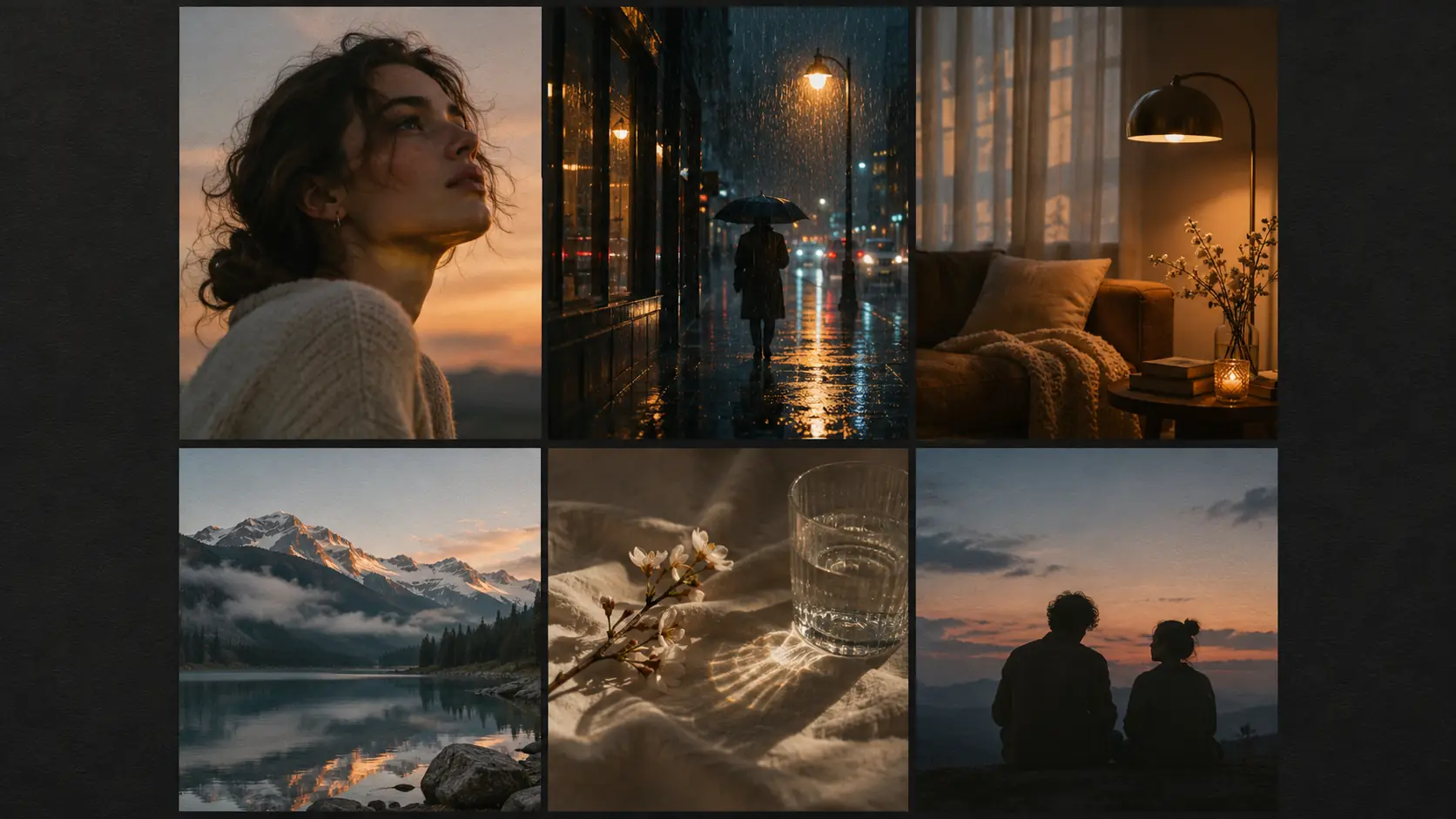
Six concepts cover most feeds: portrait, night street, interior, travel, detail and duo. Each one gives the crop a different subject and the grid a different rhythm.
| Concept | Image | Light | Crop note |
|---|---|---|---|
| Portrait | Off-center face, shallow focus. | Soft motivated key, cool rim. | 4:5, face away from top edge. |
| Night street | Wet street, neon, lone figure. | Hard practical, deep shadow. | 4:5, keep figure central. |
| Interior | Warm room, window light, quiet detail. | Window key, practical fill. | 4:5 or 1:1, protect the window. |
| Travel | Small figure in a wide landscape. | Golden hour, atmospheric depth. | 4:5, central safe area for 9:16. |
| Detail | Object or texture on a plain field. | Single hard or soft source. | 1:1, generous negative space. |
| Duo | Two figures, distance or touch. | Warm practical, cool ambient. | 4:5, keep both faces inside. |
Where does the caption or cover text go?
Leave a quiet area for text, but do not bake the text into the image. Instagram captions sit below the post, and cover text for Reels or carousels is added in the app or a design tool. If you want a title on the image, add it after the render.
Keep any on-image text to a few words and place it away from the face. A cinematic post can work with no text at all; the image and caption can carry the story. If the image needs a sentence to explain itself, the composition is not doing its job.
Think of the caption as the second frame. It can carry the context the image deliberately withholds, so the image does not need to explain everything. If the post is part of a carousel, use the first frame as the hook and the following frames as the story; keep the palette and light logic consistent across the set. The caption and the image should feel like they were made together, not like a photo with a paragraph attached.
- Quiet area for optional text.
- No AI-rendered lettering.
- Keep text away from the face.
- A few words maximum on the image.
- Captions belong in the app.
- The image should work without text.
What are common AI Instagram mistakes?
The first mistake is a busy image that disappears in the feed. The second is a low-contrast grade that looks subtle at full size and muddy on a phone. The third is a 16:9 composition cropped to 4:5 or 9:16, cutting the subject.
The fourth is AI-rendered text. The fifth is a generic filter look with plastic skin. The sixth is a grid with no palette consistency. A feed is a sequence; the individual post has to work alone and with its neighbours.
- Busy image with no dominant shape.
- Low contrast on a phone screen.
- Wrong ratio, cropped subject.
- AI-rendered text.
- Generic filter and plastic skin.
- No palette consistency across the grid.
Frequently asked
What ratio should a cinematic Instagram post be?
4:5 gives the most vertical space in the feed and is native in Soul Cinema. 1:1 is the classic square and is also native. 9:16 is for Stories and Reels and requires a design-tool crop or extension.
How do I make an Instagram post look cinematic?
Use one clear subject, one motivated light, a restrained palette and strong value contrast. Compose for the feed crop, keep the subject inside the safe area and avoid a generic global filter.
Should I add text to the image?
Optional, and only a few words. Never ask the image model to render text; add it in the app or a design tool. The image should work without text, with the caption carrying the story.
How do I keep contrast on a phone screen?
Use one strong value contrast, a warm key and a cool separation, and a simple background. Test the post at phone size and in grayscale; if the subject disappears, increase the separation.
How do I keep an Instagram grid consistent?
Fix the palette, lens, stock and subject scale across the posts. Review the grid at thumbnail size and use the same light logic from post to post.
Does Soul Cinema add the caption or cover text?
No. Soul Cinema renders the still only. Captions and cover text are added in Instagram or a design tool after the image is approved.
Your first cinematic frame is one prompt away
Sign in with Google, pick a plan and keep every still at the resolution the model produced. Plans from $12/month, cancel at any time. No watermark, no re-encode.