
Cinematic podcast cover AI
A 1:1 show-identity workflow for cinematic podcast art: choose a host portrait or concept, protect the show-name zone and test the icon at 80 pixels.
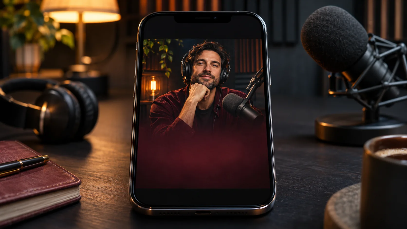
What makes a podcast cover cinematic?
A podcast cover is a show identity compressed into a square. It has to communicate the subject, the tone and the host before anyone reads the show name. A cinematic cover does that with one image, one light idea and a title zone, not with a collage of microphones and headphones.
The cover will appear as a tiny icon in a podcast app, so the same thumbnail logic applies as an album cover. The composition guide covers the eye path; this page covers the 1:1 show-icon constraints.
Soul Cinema renders the artwork. The show name and host name are added in a design tool after the image is approved.
The best podcast covers feel like a frame from the show, not a logo with a microphone. A listener should sense the tone before pressing play, even when the cover is only 80 pixels wide.
Host portrait or abstract concept?
Use a host portrait when the show is personality-led: interviews, comedy, opinion, coaching. Use an abstract or symbolic image when the show is narrative, investigative, news or anthology and the host is not the product. A hybrid works too: a small host portrait inside a larger conceptual frame.
The portrait should feel like a film still, not a headshot. Put the host in a real environment, light them with one motivated source and leave space for the show name. If the host is not recognizable, the portrait is just a face; the concept has to carry the identity.
| Show type | Anchor | Title zone | Best for |
|---|---|---|---|
| Interview | Host portrait in a studio. | Bottom or side block. | Personality-led shows. |
| True crime | Threshold, evidence or shadow. | Dark top or bottom band. | Narrative investigation. |
| Fiction | Atmospheric scene or symbol. | Quiet sky or dark field. | Audio drama. |
| Business | Host portrait or single object. | Clean side field. | Advice and interviews. |
| Culture | Two-person silhouette or scene. | Side or bottom space. | Conversation and criticism. |
| Science | Structure, landscape or object. | Dark sky or clean field. | Explainer and news. |
How do you compose for a 1:1 show icon?
Compose for the square from the first render. Keep one dominant shape, a quiet title zone and a safe margin from the edges. Podcast apps add their own UI around the artwork, so the show name should not sit on the very edge.
At small sizes, the icon should read as one thing: a face, a doorway, a landscape, an object. If the cover needs a caption to explain the concept, it is too complicated. Simplify until the silhouette works at 80 pixels.
- 1:1 native composition.
- One dominant shape or face.
- A quiet title zone, usually bottom or top.
- 10–15 percent safe margin.
- Readable at 80px as a silhouette.
- No text baked into the render.
Where does the show name go?
Put the show name in one or two lines in the quietest part of the square. The host name can sit below it in a smaller line, or be omitted if the host is already recognizable. Keep the type block together; a title split across the image looks accidental.
Use a heavy, readable typeface with strong contrast. If the background is busy, simplify it in the artwork rather than adding a heavy shadow. The show name is part of the identity, not a sticker applied at the end.
Keep the show name short enough to read at icon size. If the full title is long, use a short brand name on the cover and the full title in the app metadata. The cover is an icon, not a business card; one or two words often work better than the complete show name. The host name can be omitted when the portrait is recognizable; the show name is the priority.
- One or two title lines, bottom or top.
- Host name smaller, below the title.
- One type block, not scattered.
- Heavy readable type, strong contrast.
- No type over the face.
- Test with a placeholder show name.
Which light and palette build a show identity?
Pick one light idea and one accent color and use them across every episode. A warm portrait against a cool studio, a hard shadow with one red accent, a cold landscape with a warm practical: the repetition is what makes the cover recognizable in a feed.
The palette should survive the podcast app’s small icon. Two or three colors are enough. Avoid a rainbow of neon or a muddy midtone grade; both collapse at 80 pixels. Test the cover in grayscale as well as color.
- One light idea across the series.
- Two or three colors, one accent.
- Warm-cool separation.
- No muddy midtones.
- Readable in grayscale.
- Same palette on every episode cover.
Which six podcast cover concepts can you brief?
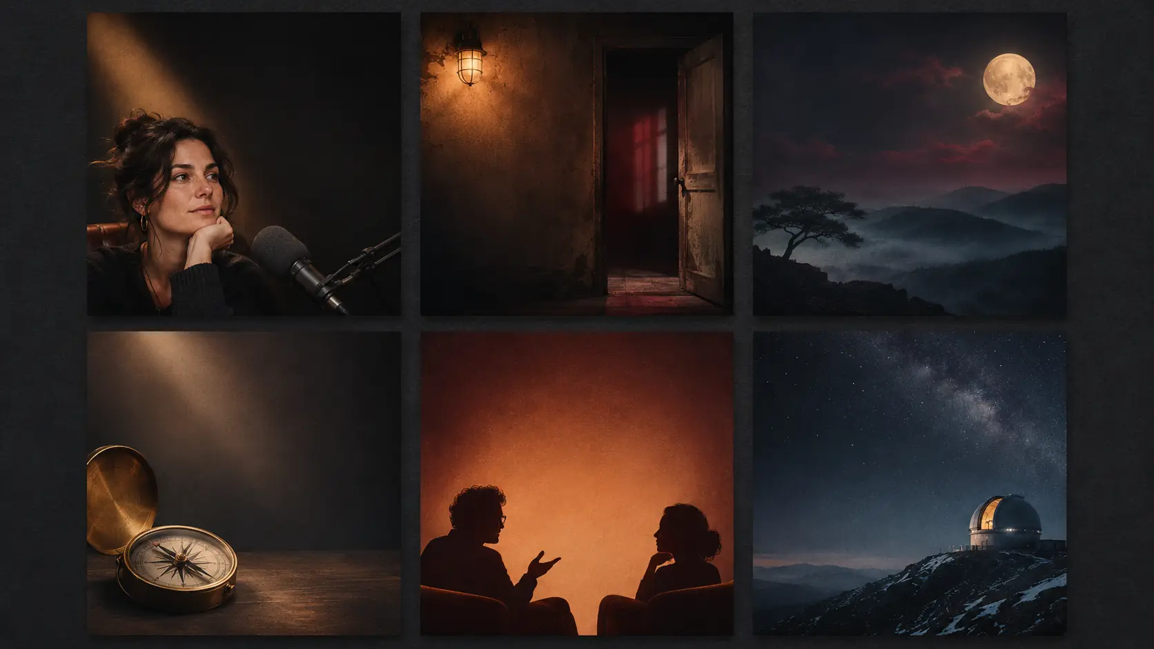
Six concepts cover most shows: interview portrait, true-crime threshold, fiction atmosphere, business object, culture two-shot and science structure. Each one gives the show name a different place to live and the show a different identity.
| Concept | Image | Title zone | Show type |
|---|---|---|---|
| Interview portrait | Host in a dim studio, warm key. | Bottom third. | Interview, comedy, opinion. |
| True-crime threshold | Doorway, shadow, evidence light. | Dark top or bottom band. | True crime, investigation. |
| Fiction atmosphere | Night landscape or abstract room. | Quiet sky or dark field. | Audio drama, fiction. |
| Business object | Single object on a clean field. | Generous side space. | Business, coaching. |
| Culture two-shot | Two silhouettes or a conversation scene. | Side or bottom space. | Culture, society. |
| Science structure | Human scale against a structure. | Dark sky or clean field. | Science, explainer. |
How do you keep a series consistent?
Keep the palette, light idea, type zone and subject scale fixed across the show’s artwork. Episode covers can change the image, but the identity should stay recognizable. A listener should know the show from the icon before reading the title.
Distinguish the show cover from episode artwork. The show cover is the permanent identity in the app; episode covers can vary, but they should still use the same palette, type zone and light logic. If every episode invents a new identity, the show disappears in the listener’s library.
Review the set as a contact sheet at icon size. Use Palette Lock for the accent and Soul ID for a recurring host. The film treatment workflow is a useful model for deciding the identity rules before the first cover.
What are common AI podcast cover mistakes?
The first mistake is asking the model to render the show name. The second is a generic microphone-and-headphones collage. The third is too much detail for an 80px icon. The fourth is a host portrait with no title space.
The fifth is an inconsistent series with a different palette or type zone on every episode. The sixth is a cover that looks like a stock photo rather than a show. A podcast cover is a brand asset; it should feel like the show sounds.
- AI-rendered show name.
- Generic microphone and headphones collage.
- Too much detail for an icon.
- Host portrait with no title zone.
- Inconsistent palette across episodes.
- Stock-photo look with no show identity.
Frequently asked
Can AI make a complete podcast cover with the show name?
AI can make the artwork, but the show name should be added in a design tool. Generate a 1:1 cover with a title-safe area, then add the title and host name in layout software.
What size should a podcast cover be?
Most podcast platforms want a square cover, commonly 3000×3000 pixels. Soul Cinema supports 1:1 natively; export at the highest available resolution and check the final icon at 80 pixels.
Should a podcast cover use the host’s face?
Use a host portrait for personality-led shows such as interviews, comedy and opinion. Use an abstract or symbolic image for narrative, investigative or anthology shows where the host is not the product.
Where should the show name go on a podcast cover?
Put it in one or two lines in the quietest part of the square, usually the bottom or top third, with a safe margin from the edge. Keep the host name smaller and below the title.
How do I keep podcast cover art consistent?
Fix the palette, light idea, type zone and subject scale across the show. Review the set as a contact sheet at icon size before approving a new cover.
Does Soul Cinema add the podcast show name?
No. Soul Cinema renders the artwork only. The show name and host name are added in a design tool after the image is approved.
Your first cinematic frame is one prompt away
Sign in with Google, pick a plan and keep every still at the resolution the model produced. Plans from $12/month, cancel at any time. No watermark, no re-encode.