
AI movie poster generator
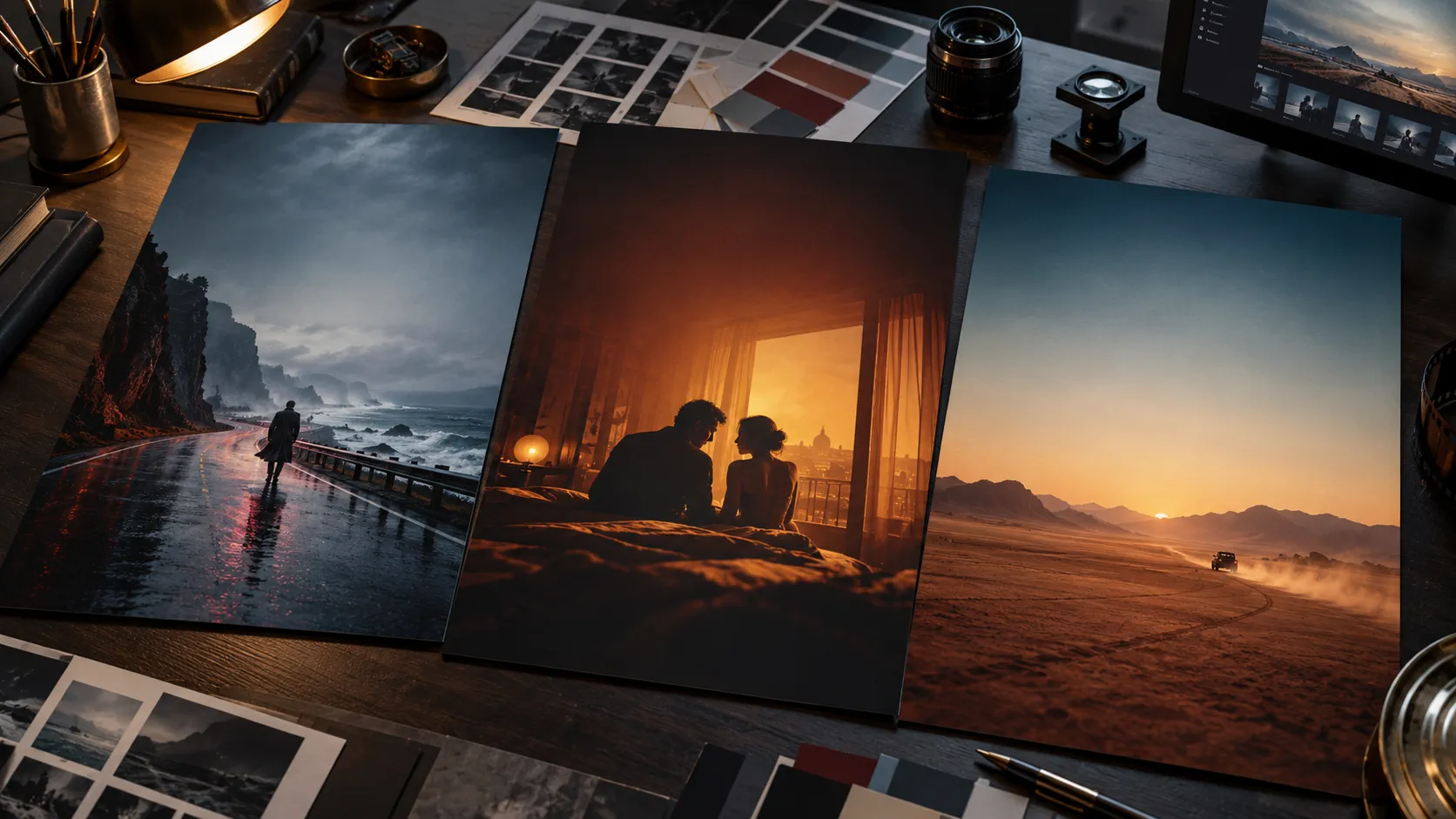
Create a cinematic poster plate from one strong visual idea, with title-safe space left open and typography handled after the image.
What does an AI movie poster generator create?
An AI movie poster generator creates the visual half of a poster: the key art, photography, lighting, atmosphere and space reserved for a title. Soul Cinema renders a cinematic still that can become that key image. It does not add a finished title treatment, billing block or distribution credits.
That boundary is useful. Image models are strongest when asked to make one strong visual idea. Precise typography, cast names and credit blocks belong in a layout tool after the artwork is approved. Treat the generated frame as the poster plate, not the final designed poster.
Start with the canvas in mind. A vertical poster is composed differently from a 16:9 still: the subject, negative space and eye line must work at thumbnail size. The film still generator guide covers cinematic image language; this page turns it toward key art.
What makes a movie poster image work?
A poster image needs one immediate idea, a readable silhouette and a deliberate title zone. The viewer should understand genre, mood and protagonist before reading anything. If the prompt produces five equally important objects, the poster has no hierarchy and the title will have nowhere to live.
Film key art also needs scale. A face that works in a full-frame still may disappear at one inch wide; a tiny figure in a vast landscape may become the entire idea. Compose for the smallest version first, then refine the large one.
| Decision | Strong choice | Weak choice |
|---|---|---|
| Visual idea | A lone figure beneath one impossible light source. | A montage of eight characters, props and locations. |
| Silhouette | A subject or shape identifiable at thumbnail size. | A low-contrast figure hidden inside busy architecture. |
| Eye line | The character or central shape directs the viewer into the image. | Every subject looks in a different direction. |
| Title space | Open sky, wall, shadow or controlled negative space. | High-frequency detail behind the title area. |
| Colour | Two or three meaningful anchors with one dominant temperature. | An even spread of saturated colours. |
How should you choose a poster aspect ratio?
Choose the output ratio before generating. A portrait poster needs a vertical composition, not a landscape image cropped later. Reserve the title area during composition and test the image in its final aspect ratio at thumbnail size.
Common poster layouts use a tall portrait canvas, while streaming thumbnails and social crops may be wider. Decide which deliverable is primary. If you need both, generate separate compositions rather than relying on one aggressive crop to preserve the subject and the title space.
- Narrative one-sheet: a tall portrait composition with a clear title zone.
- Streaming card: simpler subject placement with more tolerant cropping.
- Character poster: one actor, one graphic idea and a smaller shared credit area.
- Teaser image: less information, stronger atmosphere and more negative space.
- Social cutdown: test a separate wide composition instead of cropping the one-sheet.
How do you write a movie poster prompt?
Use a seven-line prompt: format and ratio, genre and premise, hero subject, environment, light, composition and title-safe space. Keep the premise specific enough to generate a visual conflict. “A thriller poster” has no image; “a small motel room dwarfed by one red corridor light, with a lone figure facing the door” does.
- Format: “vertical fictional movie key art, no typography.”
- Genre and premise: name the emotional promise in one sentence.
- Hero subject: define one person, object or landscape and its scale.
- Environment: place the subject in a readable world with fixed anchors.
- Light: choose one dominant source and one accent source.
- Composition: state where the subject sits and where the title space stays open.
- Finish: name the lens, palette, contrast and grain without asking for extra details in the title zone.
Which five movie poster prompts can you adapt?
These prompts target visual ideas, not finished campaigns. Replace the setting, wardrobe and premise with your own, then adjust the title-safe side to suit the typography you will add later.
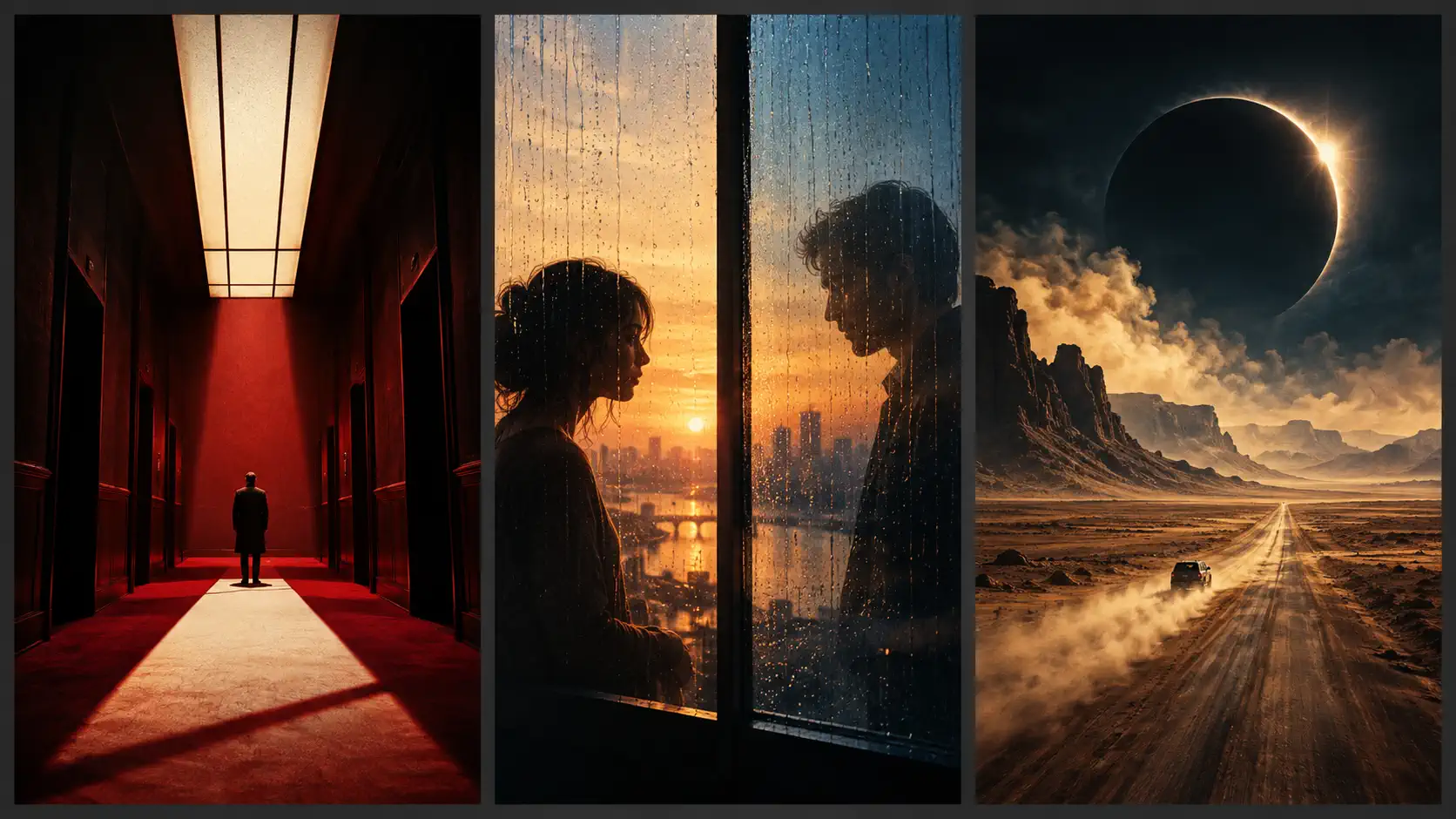
- Psychological thriller: “Vertical key art, one small figure at the end of a long crimson hotel corridor, hard overhead light, deep geometric shadows, bone-white title space above, no text.”
- Romantic drama: “Vertical key art, two adult silhouettes separated by a rain-covered window at sunrise, amber interior against blue exterior, quiet space at the bottom for a title, no text.”
- Science-fiction road film: “Vertical key art, a tiny car crossing an immense desert beneath a black eclipse, ochre and steel blue, open sky for the title, no text.”
- Crime story: “Vertical key art, a lone detective reflected in a wet phone booth at night, one sodium lamp, hard noir contrast, controlled title space in the darkness, no text.”
- Family adventure: “Vertical key art, one child and a dog seen from behind before an open forest path, warm sunrise through cool trees, generous sky for the title, no text.”
Where should you leave space for the title and credits?
Choose the title zone before rendering. It can be sky, shadow, a wall, water or deliberately quiet foreground, but it must have low visual competition. Keep faces, hands, key props and bright practical lights out of that area.
Leave a second quiet band for a billing block if the design requires one. Do not ask the image model to write placeholder text. Unreadable pseudo-typography distracts from the art and cannot be safely edited; an empty zone is more useful than invented letters.
- Keep the title zone away from the subject’s eyes and hands.
- Avoid bright highlights behind future type.
- Reserve enough contrast for white or dark lettering after layout.
- Keep important imagery inside a safe crop for alternate sizes.
- Add typography in a design tool using licensed fonts and accurate credits.
How do you test key art before adding typography?
View the image at phone-thumbnail size with a blank rectangle over the title zone. If the rectangle erases the main idea or the subject no longer reads, the composition is not ready. Next, imagine a title line in both light and dark versions and check whether the image can support one.
Run a second test by cropping the poster to a wide social shape. The primary subject should survive without the title zone swallowing it. If the crop fails, render a separate composition for that placement rather than forcing one image to do every job.
- Check the untitled image at thumbnail size.
- Mask the title zone and confirm the visual idea still reads.
- Check subject scale and eye line at full size.
- Inspect faces, hands and practical lights for obvious image artefacts.
- Add temporary type in your design tool; keep it separate from the generated plate.
- Export the final artwork after the title treatment and credits are locked.
What are the limits of AI movie poster generation?
An AI image generator can produce a convincing key-art plate, but it is not a poster template, a font licence or a substitute for a designer. Titles, billing blocks, release information, legal marks and production credits need accurate text and layout control.
Avoid recognisable film franchises, celebrities and copyrighted campaign compositions unless you have the rights. A fictional premise and an original visual idea are safer and usually stronger. Use AI for the artwork and keep the publishing details under human control.
Frequently asked
Can I create a full movie poster with AI?
You can create the poster image, often called key art, with AI. Add the title, billing block, credits and release details in a design tool afterward. Soul Cinema generates the cinematic plate; it is not a poster-layout editor.
What prompt makes an AI movie poster look cinematic?
Name one visual idea, one subject, one dominant light source, a defined poster ratio, a restrained palette and explicit negative space for typography. Avoid a montage of unrelated objects and avoid asking the image model to write text.
Should the AI image include the movie title?
No. Generate a clean key-art plate without text, then add the title and credits in a design tool. That keeps the typography readable, editable and legally accurate, and prevents pseudo-text from becoming part of the image.
Can I use an AI movie poster for a real film?
Use the artwork as a concept or final plate only when you have the rights to the people, brands, locations and source material involved. A design and legal review still applies to titles, credits, trademarks and distribution requirements.
Why does my AI poster look busy at thumbnail size?
The image lacks one dominant silhouette or has too many equally important details. Rebuild the prompt around one visual conflict, remove secondary props and reserve a low-frequency area for the title. Test the image before any typography is added.
Your first cinematic frame is one prompt away
Sign in with Google, pick a plan and keep every still at the resolution the model produced. Plans from $12/month, cancel at any time. No watermark, no re-encode.