
AI film pitch deck
A visual workflow for film pitch decks: one look per slide, a locked cast and location system, clean plates for layout and a deck that reads as one film.
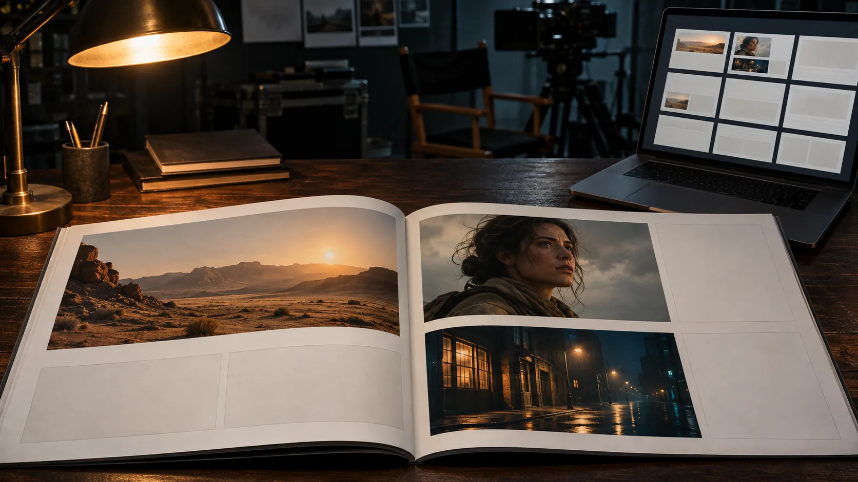
What makes an AI film pitch deck work?
A pitch deck sells a film that does not exist yet. The reader needs to see the world, feel the tone and believe the cast before they read the budget. Concept stills do that work faster than prose, but only when they look like they belong to the same film. Ten beautiful images from ten different films is a mood board, not a pitch.
The deck is not a storyboard and not a treatment. A storyboard explains shot order; a treatment explains the visual rules; a pitch deck compresses both into an argument for the project. The stills should carry the argument: this is the world, this is the face, this is the light, this is why it is worth financing.
Decide the visual rules first with the film treatment workflow, then build the deck. The storyboard guide covers sequence order once the deck has done its job.
Which slides need a concept still?
A feature deck usually runs ten to fifteen slides; a short or proof of concept runs six to eight. Not every slide needs an image. The cover, the world, the characters, the look and the sequence do. The budget, schedule and team slides can stay typographic.
Give each visual slide one job. The cover establishes tone, the world slide establishes scale, the character slide establishes faces, the look slide establishes the palette and lens, and the sequence slide shows that the film can sustain its look across scenes.
| Slide | Job | Image | Ratio |
|---|---|---|---|
| Cover / title | Establish tone in one frame. | Hero key art with title-safe space. | 2.39:1 or 16:9 |
| Logline / world | Show the scale and the rules of the place. | Wide establishing still with a human anchor. | 2.39:1 |
| Characters | Make the cast feel real and specific. | One portrait per lead, same light and background. | 4:5 or 1:1 |
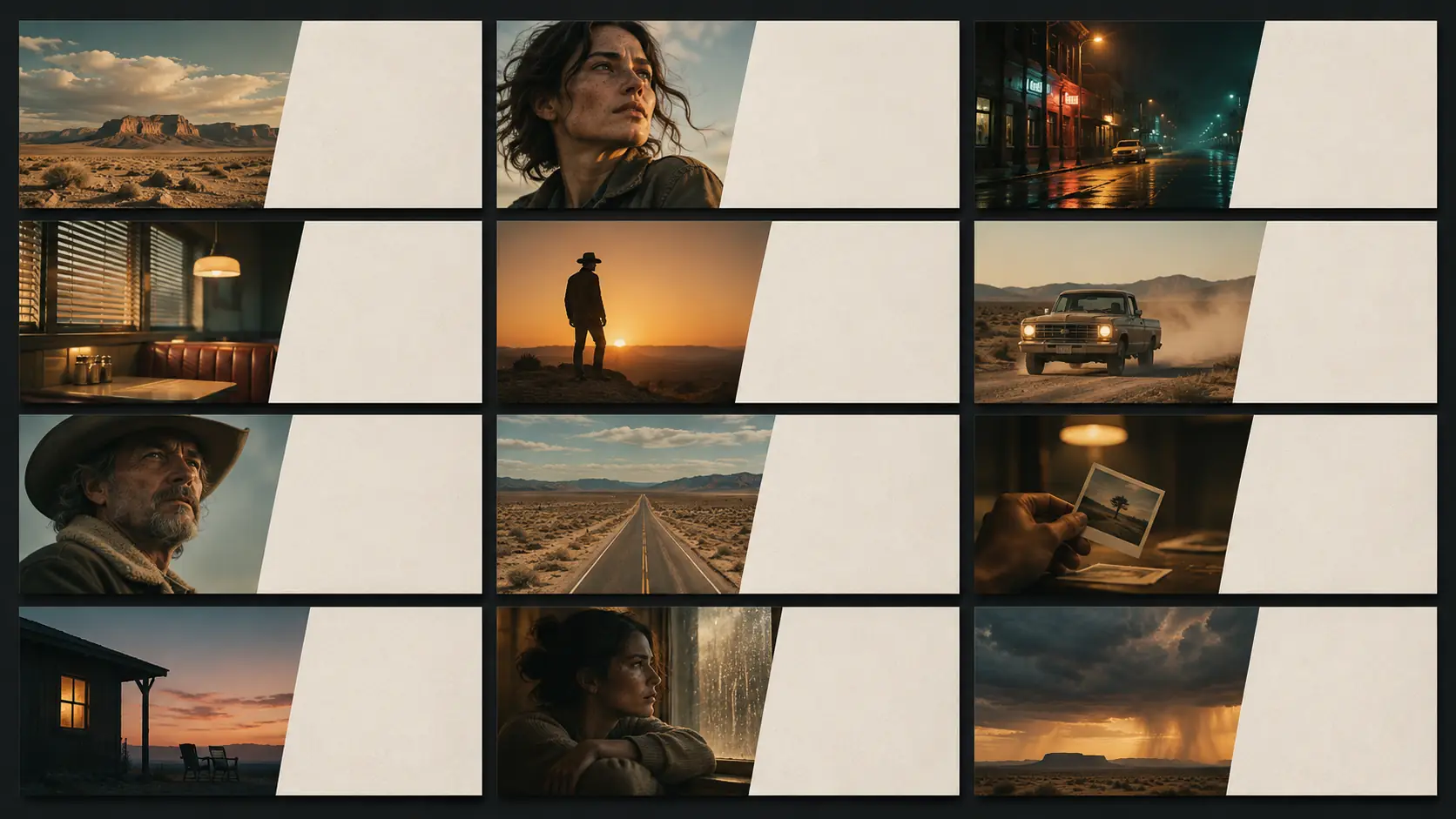
| Tone / look | Prove the palette, lens and texture. | Six-to-nine frame grid from the same film. | 16:9 grid |
| Locations | Show three places that define the world. | One still per location, consistent weather. | 2.39:1 |
| Sequence | Prove the look survives a scene. | Three to six frames in story order. | 16:9 |
| Comparables | Position the film in the market. | One restrained key art, no collage. | 16:9 |
| Team / contact | Stay typographic. | No image, or a small texture strip. | None |
How do you keep the cast and locations consistent?
Lock the face before you render the deck. Use one reference pack per lead — front, three-quarter, profile, wardrobe — and keep the same light in every portrait. A deck where the lead changes face between slides loses the reader immediately, even if each individual image is strong.
Locations need the same discipline. Pick three or four places, fix their time of day and weather, and keep the palette stable. If the street is wet on the character slide and dry on the sequence slide, the world stops feeling like one film.
Keep the cast with Soul ID and the reference views with the character reference sheet workflow. Review the whole deck as a contact sheet before it goes to layout.
How do you build the look page?
The look page is the heart of the deck. It should show six to nine frames that share one palette, one light logic and one lens. A producer should be able to point at it and say “that is the film” without reading the caption.
Write one short paragraph beside the grid: the palette in plain words, the light idea, the lens and the stock. Keep hex codes in the deck notes rather than on the image. The page is a visual argument, not a spec sheet.
- Six to nine frames from the same film.
- One palette, ideally three to five colors.
- One light logic across every frame.
- One lens family and one stock line.
- At least one face and one place.
- No text baked into any image.
Which ratio and resolution should the deck use?
Deck slides are usually 16:9. Key art can be 2.39:1 for a cinematic cover, character cards often work at 4:5 or 1:1, and press or poster pages may need 2:3. Render the ratio you will actually place; cropping a 16:9 image into a 2.39 cover usually removes the top of the head or the bottom of the frame.
Keep enough resolution for the largest placement. A 1672-pixel-wide still is fine for a laptop deck but soft on a printed leave-behind. If the deck will be printed, render the cover and character pages at the highest available size and keep the layout simple.
| Placement | Ratio | Notes |
|---|---|---|
| Deck slide | 16:9 | Default for laptop and PDF presentation. |
| Cover key art | 2.39:1 | Cinematic, but leave title-safe space. |
| Character card | 4:5 or 1:1 | Portrait crops with consistent headroom. |
| Printed leave-behind | 2:3 or A4 | Render larger; avoid upscaling a slide image. |
| Social teaser | 4:5 or 9:16 | Separate render, not a crop of the cover. |
| Press / poster | 2:3 | Keep the title area free of detail. |
How do you avoid the “AI deck” look?
The AI look comes from inconsistency, not from the tool. Different grades, different lenses, different skin treatments and over-rendered detail make a deck feel synthetic. A restrained, repeated look reads as art direction.
Do not let the model render text, logos or credits. Generate clean plates and add typography in the layout tool. Mix in one or two real reference images if the deck needs provenance, but keep them clearly separated from the concept stills.
- One grade and one lens across the deck.
- No text, logos or credits in the render.
- Restrained detail; avoid “hyperreal” and “8K”.
- Same face and wardrobe across character slides.
- Same weather and time of day across locations.
- Typography added in layout, not in the image.
How do you hand the deck to a designer?
Export clean stills with consistent naming: film name, slide number, ratio and version. Keep a folder for selects and a folder for alternates. The designer needs to know which image is approved and where the title-safe area sits.
Write a one-page look note with the palette, light logic, lens and stock. That note is what keeps the deck consistent when a new image is added later. It also becomes the prompt block for the next round of stills.
Keep the palette with Palette Lock and the exact colors with Soul HEX. The mood board workflow is the right place to decide the references before the deck images are rendered.
What are common AI pitch deck mistakes?
The first mistake is a deck of unrelated beautiful images. The second is a different face on every character slide. The third is baked-in text that has to be removed in layout. The fourth is over-rendered detail that reads as fantasy art rather than a film.
The fifth is a cover with no title-safe space. The sixth is a look page with ten competing palettes. A pitch deck is a controlled argument; every image should make the same film feel more inevitable.
- Unrelated images with no shared look.
- A different lead face on each slide.
- Text or logos baked into the render.
- Hyper-detailed fantasy art instead of film stills.
- No title-safe area on the cover.
- A look page with too many palettes.
Frequently asked
How many images should a film pitch deck have?
A feature deck usually needs eight to twelve concept stills across the cover, world, characters, look and sequence slides. A short or proof of concept can work with five or six if the look is consistent.
Can AI generate a complete film pitch deck?
AI can generate the concept stills and help draft the text, but the deck structure, the argument and the layout still need a human. Generate clean plates, then add typography and slide order in a design tool.
How do I keep the same actor across pitch deck images?
Build a reference pack with front, three-quarter and profile views, lock the face with Soul ID, and keep the same light and wardrobe in every portrait. Review the character slides together before adding more.
Should pitch deck stills have text on them?
No. Generate clean images and add titles, credits and captions in the layout tool. Baked-in text is usually misspelled and cannot be edited later.
What aspect ratio is best for a film pitch deck?
16:9 for slides, 2.39:1 for cinematic cover art, 4:5 or 1:1 for character cards, and 2:3 for printed leave-behinds or posters. Render the ratio you will place rather than cropping a slide image.
Does Soul Cinema lay out the pitch deck?
No. Soul Cinema renders the stills. Slide layout, typography and export happen in a presentation or design tool after the images are approved.
Your first cinematic frame is one prompt away
Sign in with Google, pick a plan and keep every still at the resolution the model produced. Plans from $12/month, cancel at any time. No watermark, no re-encode.