
AI product photography
A material-first product workflow: one light shape, controlled reflections, the right surface for the product and a six-frame set that stays consistent.
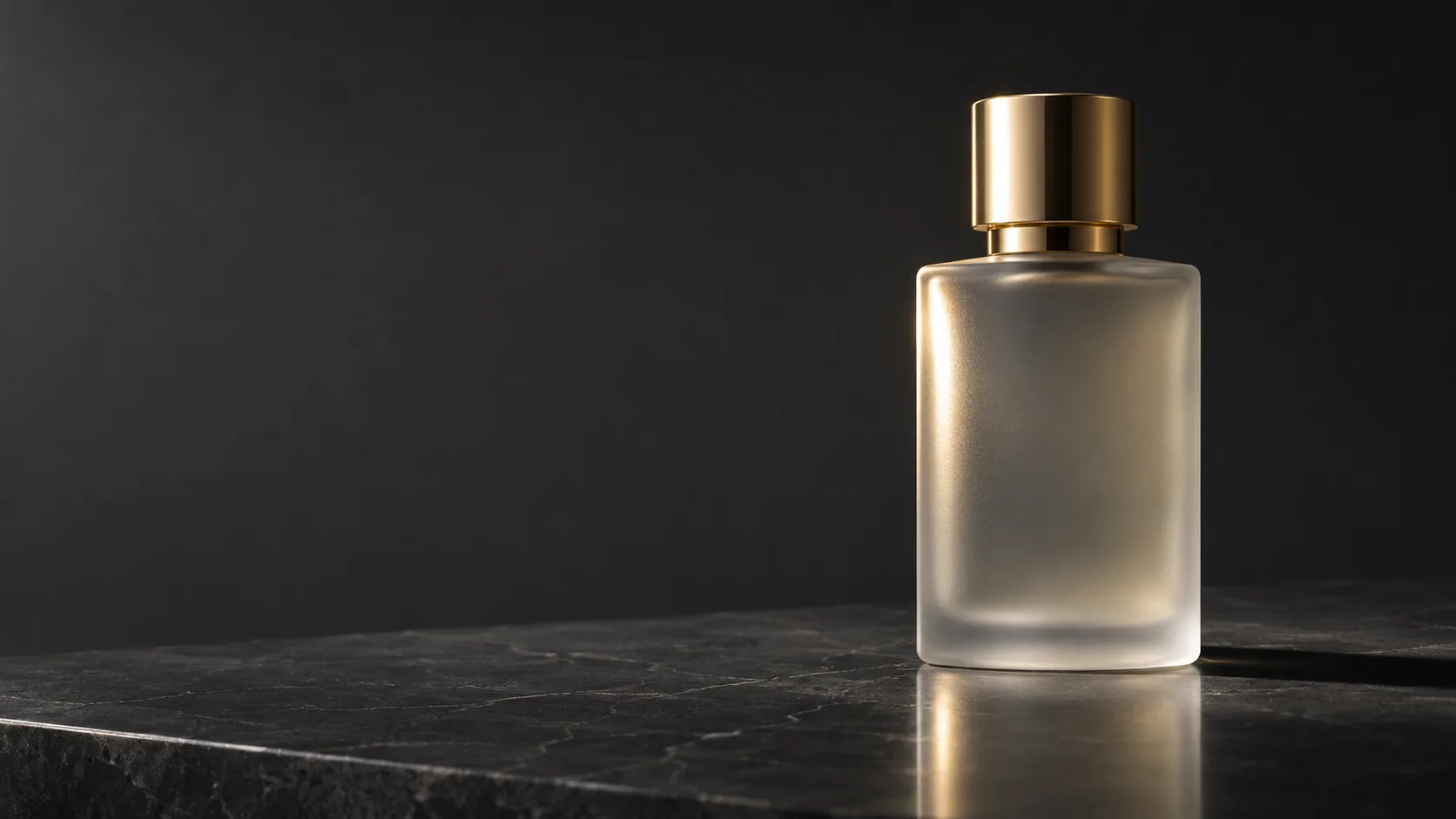
What makes product photography cinematic?
A product photograph is a portrait of an object. The bottle, the watch or the headphone is the character; the light describes its shape, the surface describes its world, and the reflection describes its material. A catalog image shows the product clearly; a cinematic product image makes the material feel expensive.
The difference is control. One light shape, one highlight, one shadow and one background are enough. When every surface reflects a different source, the product looks noisy rather than premium. Cinematic product work is mostly subtraction.
Start with the lighting cheat sheet for source vocabulary, then use this page for surfaces and reflections. The fashion editorial workflow covers garments and campaign sequencing.
Which light shape should you use?
The light shape matters more than the light color. A hard source gives a crisp highlight and a defined shadow. A large softbox gives a broad gradient. A strip light gives a long, narrow highlight that follows a curved edge. Backlight makes translucent materials glow. On-axis light flattens the reflection but removes texture.
Pick the shape by the material. Glass and glossy plastic want a controlled strip or gradient. Matte ceramics want a broad soft source. Metal wants a defined highlight and a dark edge. Textured fabric wants a grazing side light.
| Light shape | Highlight | Best for | Watch out for |
|---|---|---|---|
| Hard key | Small, sharp, high contrast. | Matte ceramics, textured stone, editorial drama. | Harsh shadow and blown highlights. |
| Large softbox | Broad gradient, soft edge. | Matte cosmetics, skincare, clean commercial. | Flat, catalog-like light. |
| Strip light | Long narrow highlight. | Glass bottles, curved plastic, metal edges. | Two strips can look like a showroom. |
| Backlight | Glowing edge, translucent body. | Glass, liquid, perfume, translucent plastic. | The front face can go too dark. |
| On-axis ring | Even frontal light, minimal shadow. | Beauty, small objects, quick catalog. | Loses shape and surface texture. |
| Window light | Soft directional gradient. | Lifestyle, natural cosmetics, food-adjacent. | Weather and time-of-day drift. |
How do you control reflections?
On a glossy product, the reflection is the shape. A single long highlight tells the viewer the bottle is curved; a chaotic reflection tells them nothing. Describe the highlight as a shape: “one long vertical highlight down the left edge” or “a soft gradient across the front face”.
Use the environment as a reflector. A black card on one side gives the product a dark edge; a white card on the other gives it separation. For glass, decide whether the background is brighter or darker than the product, because that determines whether the edges read as light or dark lines.
- Name one primary highlight and its shape.
- Keep the rest of the reflections quiet.
- Use a dark edge on one side and a light edge on the other.
- Match the background value to the product edge.
- Avoid multiple competing sources on glossy surfaces.
- Check the highlight at thumbnail size.
How do you describe the surface and background?
The surface under the product is part of the light. Polished stone gives a faint reflection and a grounded shadow. Acrylic gives a clean mirror. Fabric absorbs light and softens the base. Water adds a second, distorted highlight. Choose one surface and describe how it responds to the key.
Keep the background quiet. A seamless gradient, a single wall or a dark void is enough. If the product needs context, add one environmental cue — a bathroom shelf, a kitchen counter, a stone ledge — and keep it out of focus. The product should remain the brightest, sharpest thing in the frame.
| Surface | Reflection | Shadow | Use for |
|---|---|---|---|
| Polished stone | Faint, soft reflection. | Defined contact shadow. | Perfume, skincare, luxury. |
| Acrylic | Clean mirror reflection. | Hard contact shadow. | Cosmetics, tech, graphic sets. |
| Fabric | Almost none. | Soft, absorbed shadow. | Lifestyle, natural products. |
| Water | Distorted, moving highlight. | Rippled shadow. | Beverage, fragrance, freshness. |
| Wood | Warm, low reflection. | Long soft shadow. | Craft, food, artisanal. |
| Seamless paper | None. | Controlled studio shadow. | Catalog, e-commerce, clean sets. |
Which ratio and crop should you deliver?
Product work usually needs more than one ratio: 1:1 for marketplace listings, 4:5 for social, 16:9 for a hero banner and 2:3 for print. Render the ratio you will place; a square crop of a tall bottle often removes the cap or the base.
Keep the product inside a generous safe area. If the same image will be cropped for multiple placements, compose with space above and below the product and keep the label area clear. Test the square crop before the final render.
| Placement | Ratio | Composition note |
|---|---|---|
| Marketplace listing | 1:1 | Product centered, generous margin. |
| Social feed | 4:5 | Vertical product, room for a caption. |
| Hero banner | 16:9 | Product on one third, negative space for copy. |
| Print lookbook | 2:3 | Tall product, title-safe area. |
| Email header | 3:1 or 4:1 | Separate render, not a crop of the hero. |
| Detail crop | 1:1 | Texture and material, no full silhouette. |
How do you build a product set?
A product set is six frames: the hero, the detail, the scale shot, the in-use frame, the packaging and the flat lay. Each frame answers a different question. The hero sells the shape, the detail sells the material, the scale shot sells the size, and the in-use frame sells the place.
Keep the light shape and the surface fixed across the set. Change the distance and the product position, not the world. If the hero is a hard side key on stone, the detail should also be a hard side key on stone, just closer.
| Frame | Job | Distance | Light |
|---|---|---|---|
| Hero | Shape, material, first impression. | Full product. | Primary light shape, one highlight. |
| Detail | Texture and construction. | Close crop. | Grazing light across the surface. |
| Scale | Size in the hand or on a shelf. | Wide with a reference object. | Same key, wider falloff. |
| In use | Place and ritual. | Environmental. | Ambient plus one key. |
| Packaging | Brand and unboxing. | Product with box. | Soft even light, clean background. |
| Flat lay | Kit and contents. | Top-down. | Large soft source, controlled shadows. |
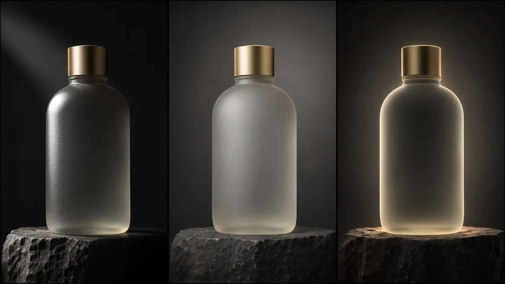
Which six product briefs should you try?
Six briefs cover the useful range: the perfume bottle, the skincare jar, the watch, the headphones, the ceramic vessel and the beverage can. Each one pairs a material with a light shape and a surface.
| Product | Material | Light | Prompt anchor |
|---|---|---|---|
| Perfume bottle | Frosted glass, metal cap. | Strip light plus backlight. | Long vertical highlight, glowing edge, dark stone plinth. |
| Skincare jar | Matte plastic, soft label. | Large softbox gradient. | Broad highlight, soft shadow, seamless warm gray. |
| Watch | Polished metal, glass. | Hard key plus dark card. | Defined bezel highlight, dark edge, macro detail. |
| Headphones | Matte plastic, fabric. | Side light plus a soft fill. | Texture on the ear cup, clean silhouette, dark background. |
| Ceramic vessel | Matte glaze, irregular surface. | Grazing side light. | Visible glaze texture, long soft shadow, stone ledge. |
| Beverage can | Brushed metal, condensation. | Backlight plus a strip. | Cold metallic edge, water droplets, dark reflective base. |
What are common product AI mistakes?
The first mistake is too many light sources, which produces a noisy reflection. The second is a generic “studio lighting” prompt that flattens the material. The third is a label or logo rendered as text. The fourth is a product that changes shape between frames.
The fifth is a background that competes with the product. The sixth is a crop that cuts the cap or the base. Product photography is a discipline of one clear shape, one clear highlight and one clear surface.
- Multiple sources on a glossy surface.
- “Studio lighting” with no shape or direction.
- AI-rendered labels and logos.
- Product proportions changing between frames.
- A background brighter than the product.
- Crops that cut the cap or the base.
Frequently asked
How do I write a product photography AI prompt?
Name the product and material, one light shape and direction, the surface and background, the highlight and the lens. For example: “frosted glass perfume bottle, one strip highlight down the left edge, dark stone plinth, charcoal seamless background, 85mm.”
How do I make glass and metal look real in AI?
Control the reflection. Give glass a long highlight and a backlit edge, and give metal a defined highlight with a dark card on one side. Avoid multiple competing sources, which turn the surface into noise.
Which lighting is best for product photography?
It depends on the material: hard key for matte texture, large softbox for clean commercial gradients, strip light for glass and curved edges, backlight for translucent products. The shape of the source matters more than the color.
What aspect ratio is best for product images?
1:1 for marketplace listings, 4:5 for social, 16:9 for hero banners and 2:3 for print. Render the ratio you will place rather than cropping a tall product out of a square frame.
How do I keep a product consistent across a set?
Fix the light shape, surface, background and lens, then change only the distance and the product position. Review the set as a contact sheet before adding more frames.
Can Soul Cinema render product labels and logos?
No. Soul Cinema renders the image, but text and logos should be added in a design tool. Ask for a clean unbranded product and add the final label in layout.
Your first cinematic frame is one prompt away
Sign in with Google, pick a plan and keep every still at the resolution the model produced. Plans from $12/month, cancel at any time. No watermark, no re-encode.